Craigslist Redesign
UI + UX Design
Concept
Craigslist is a widely recognized platform for connecting people with local jobs, housing, services, and goods, yet its outdated interface can make browsing and posting feel cluttered and difficult to navigate. This redesign reimagines the experience through a more modern, trustworthy, and accessible interface while preserving the simplicity and familiarity that define Craigslist.
Objective
The goal of this project was to improve usability and navigation across devices through clearer visual hierarchy, intuitive task flows, and a more consistent design system. Refined typography, spacing, imagery, and organization reduce information overload and strengthen user confidence, creating a responsive experience that makes content easier to discover and interact with.
Pain Points
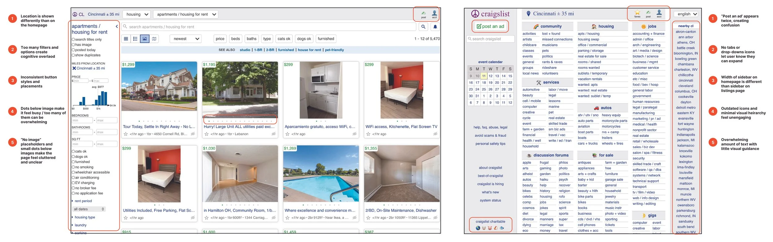
Identified key usability issues in Craigslist’s interface, including cluttered layouts, weak visual hierarchy, inconsistent spacing, and outdated typography that made navigation difficult and reduced user trust.
User Personas
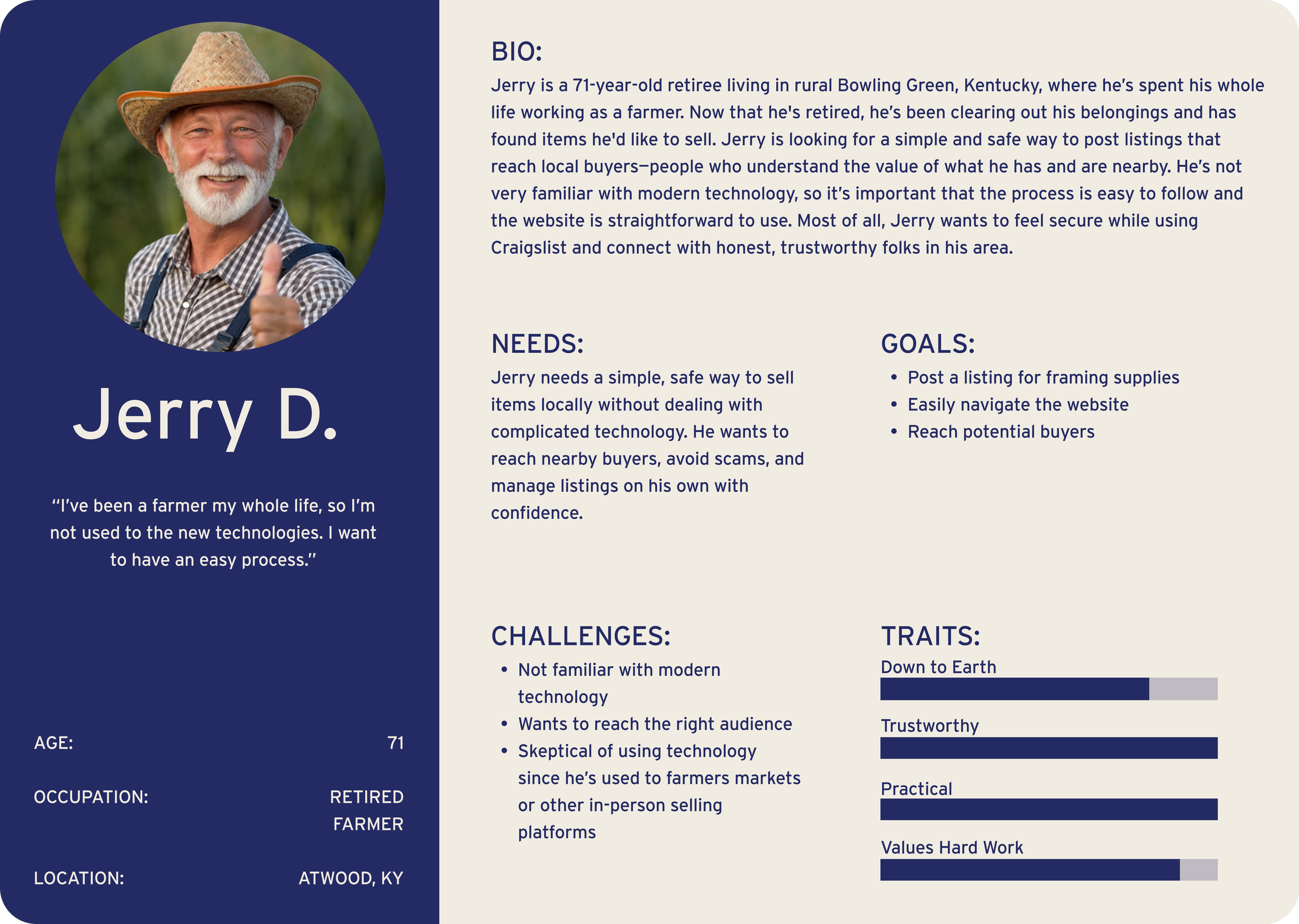
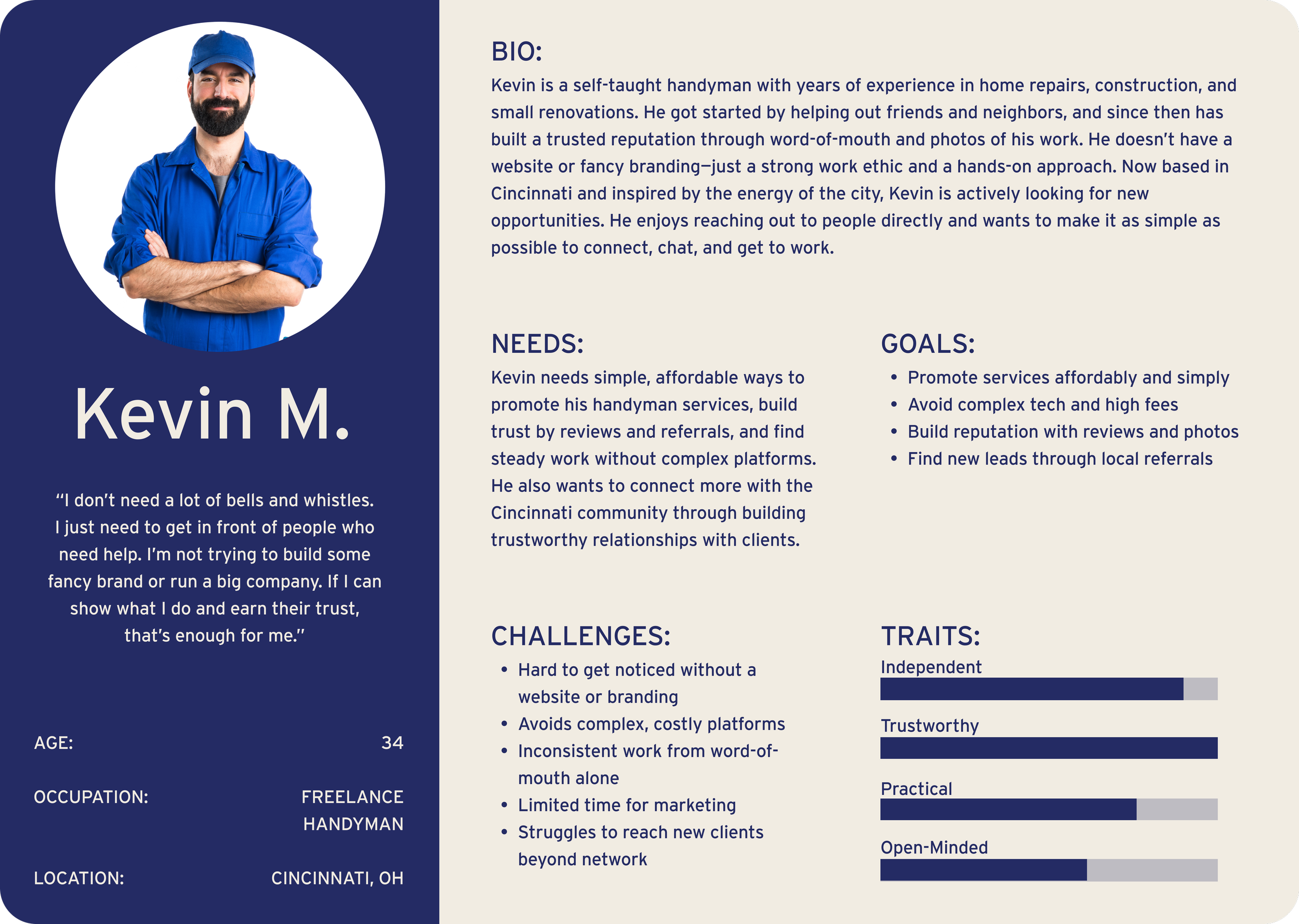
Research identified user needs for a simple, trustworthy, and accessible experience, informing task flows focused on clarity and usability.
User Task Flows + User Navigation (IA)
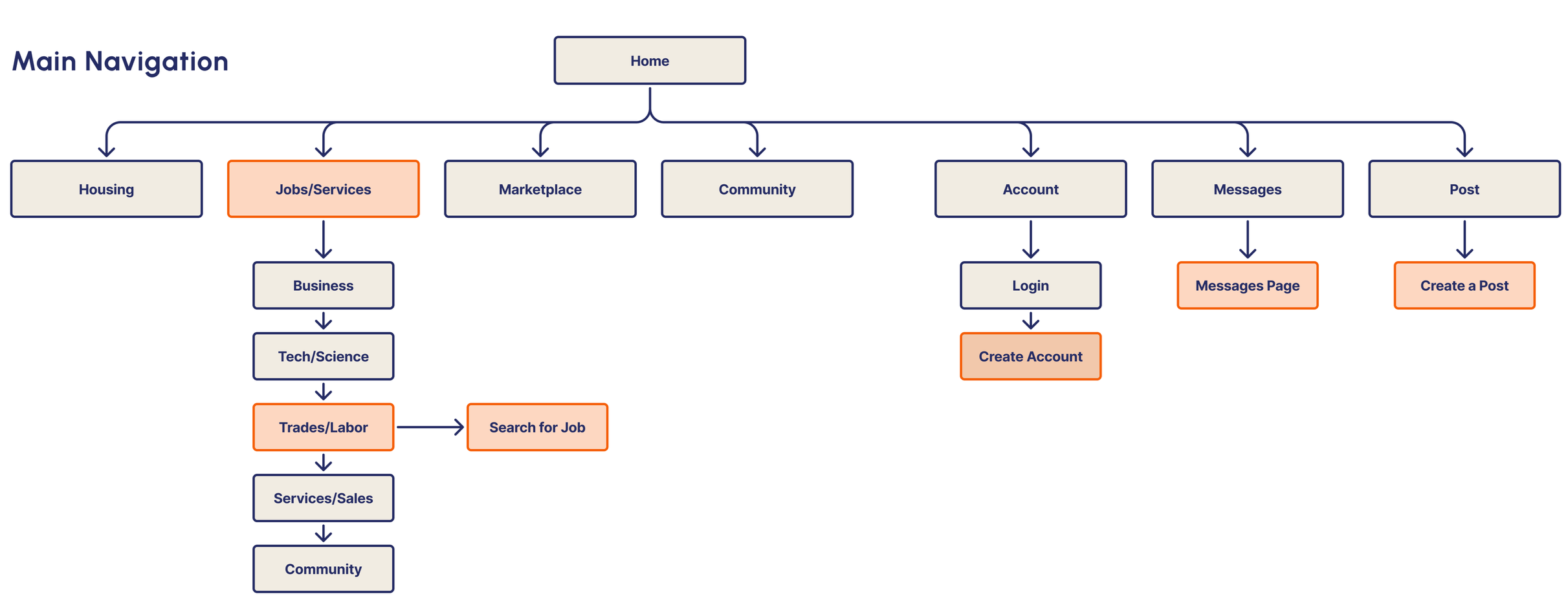
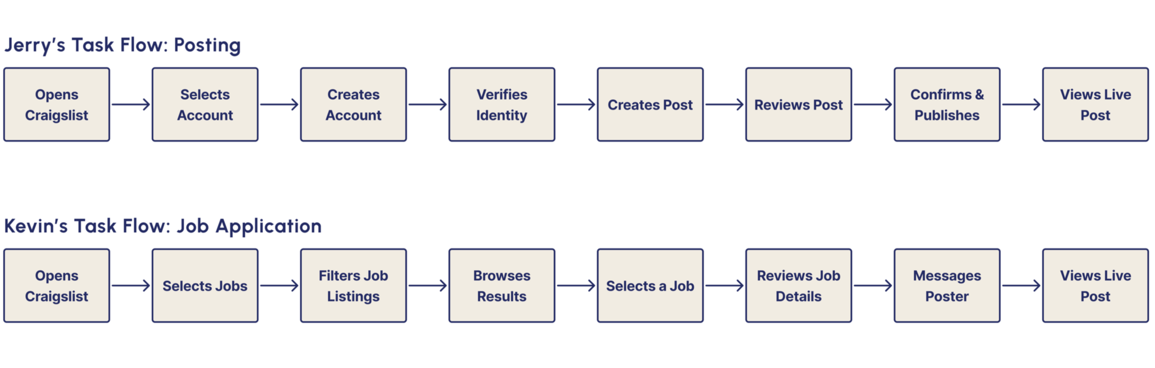
Task flows were built around each persona’s goals to identify key actions and simplify their experience. These insights informed the site’s navigation and structure, creating clearer paths for posting, browsing, and connecting.
Sketches
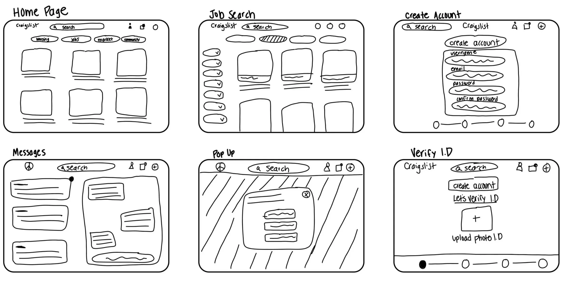
Initial sketches explored cleaner layouts and stronger hierarchy to simplify navigation and create more intuitive user flows.
Lo-Fi Wireframes
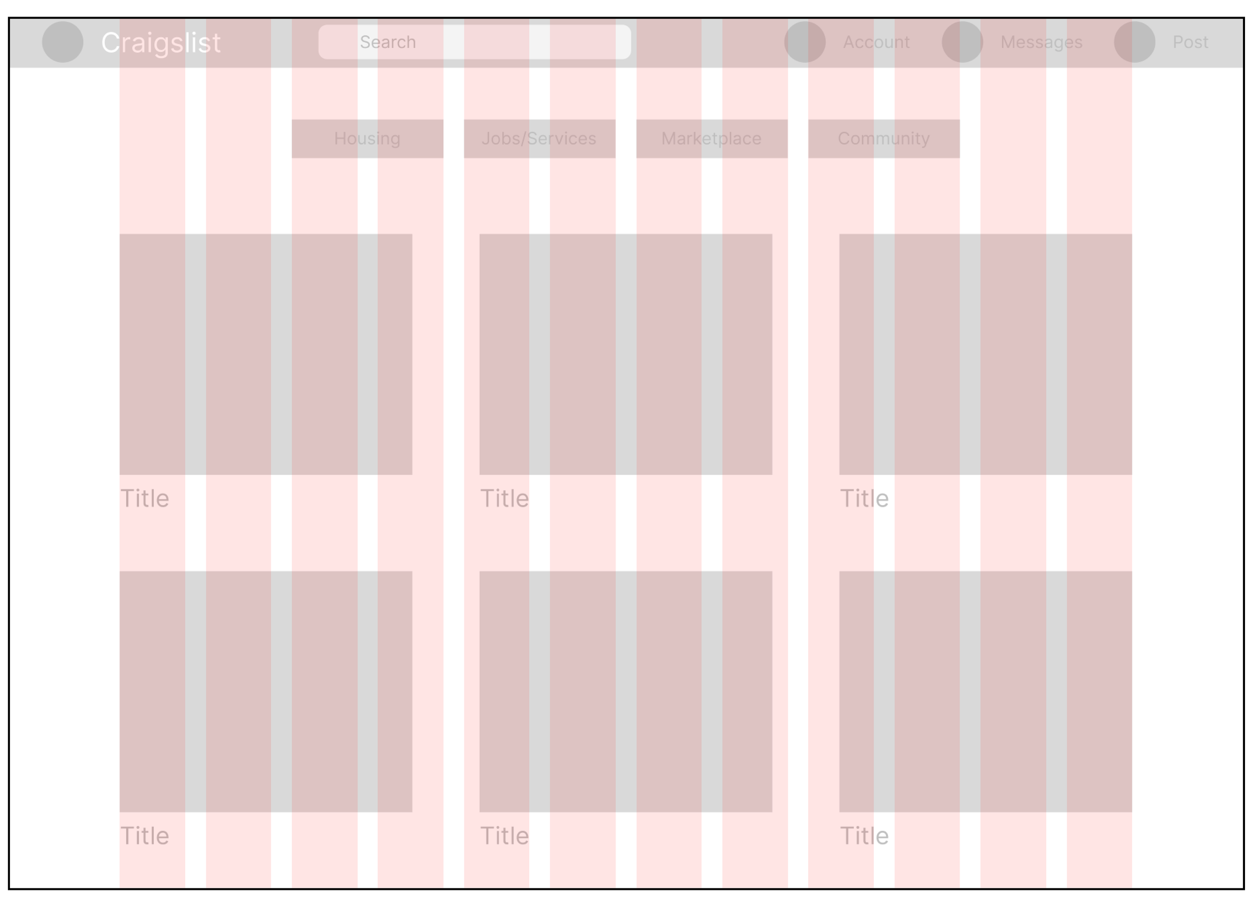
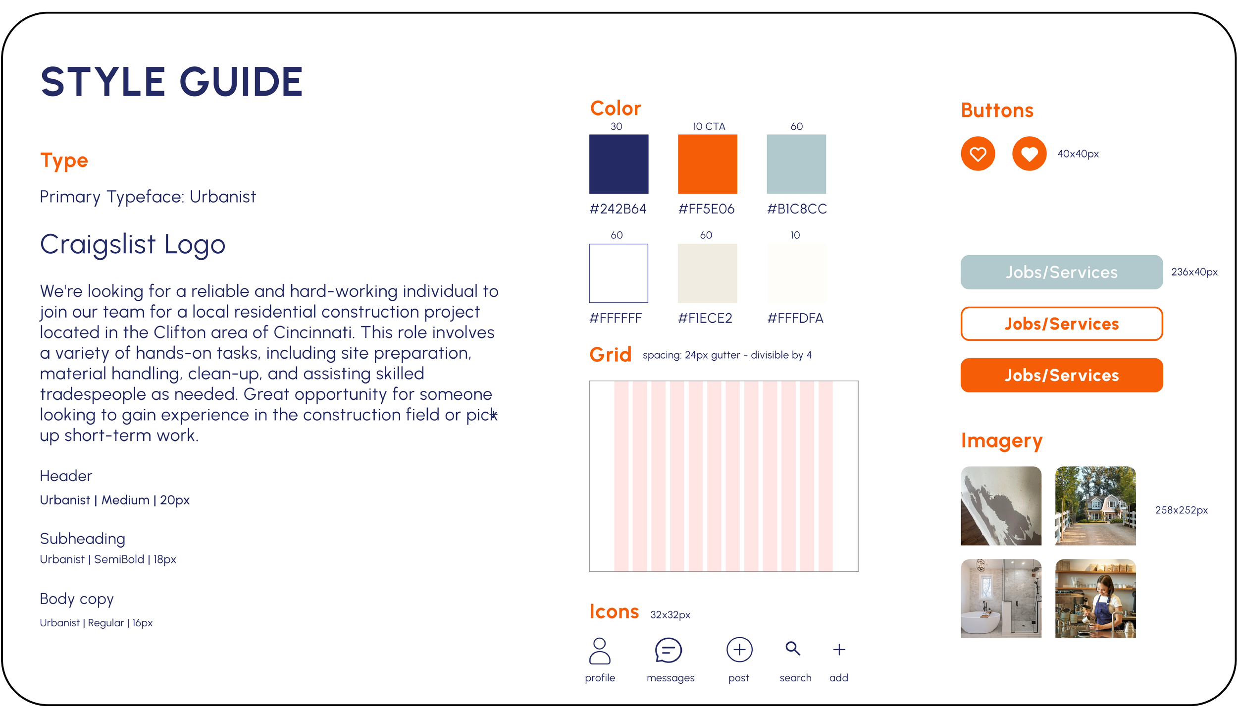
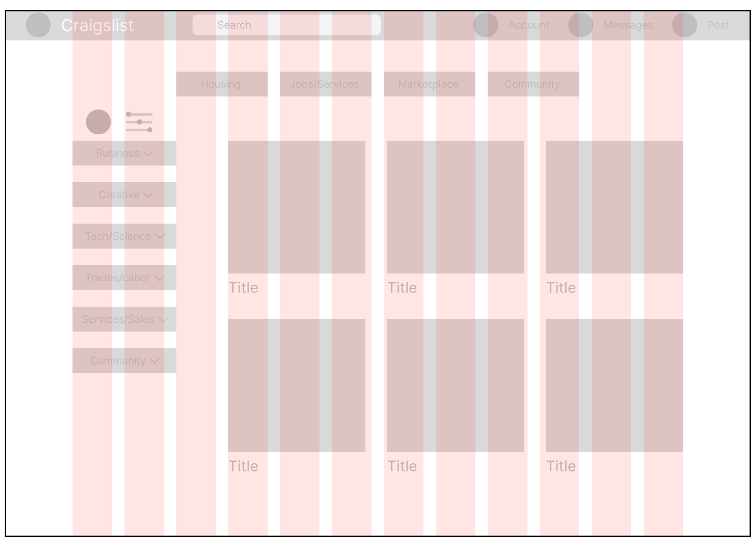
Built on a 12-column grid with 24px gutters, the wireframes create consistent layouts, clear navigation, and balanced visual structure.
Hi-Fi Wireframes
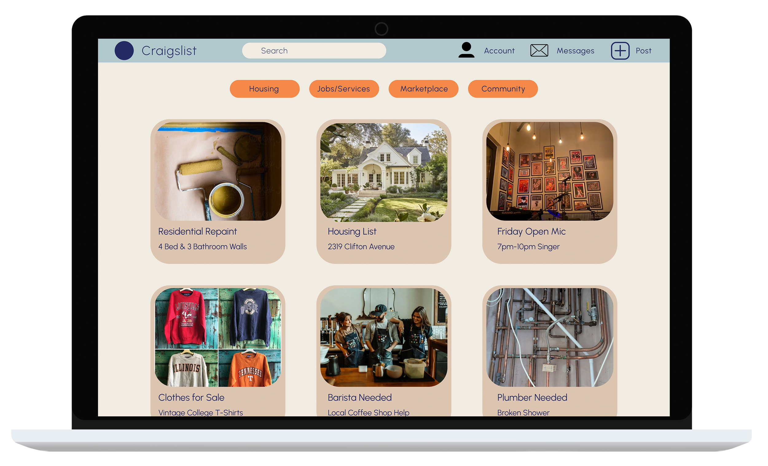
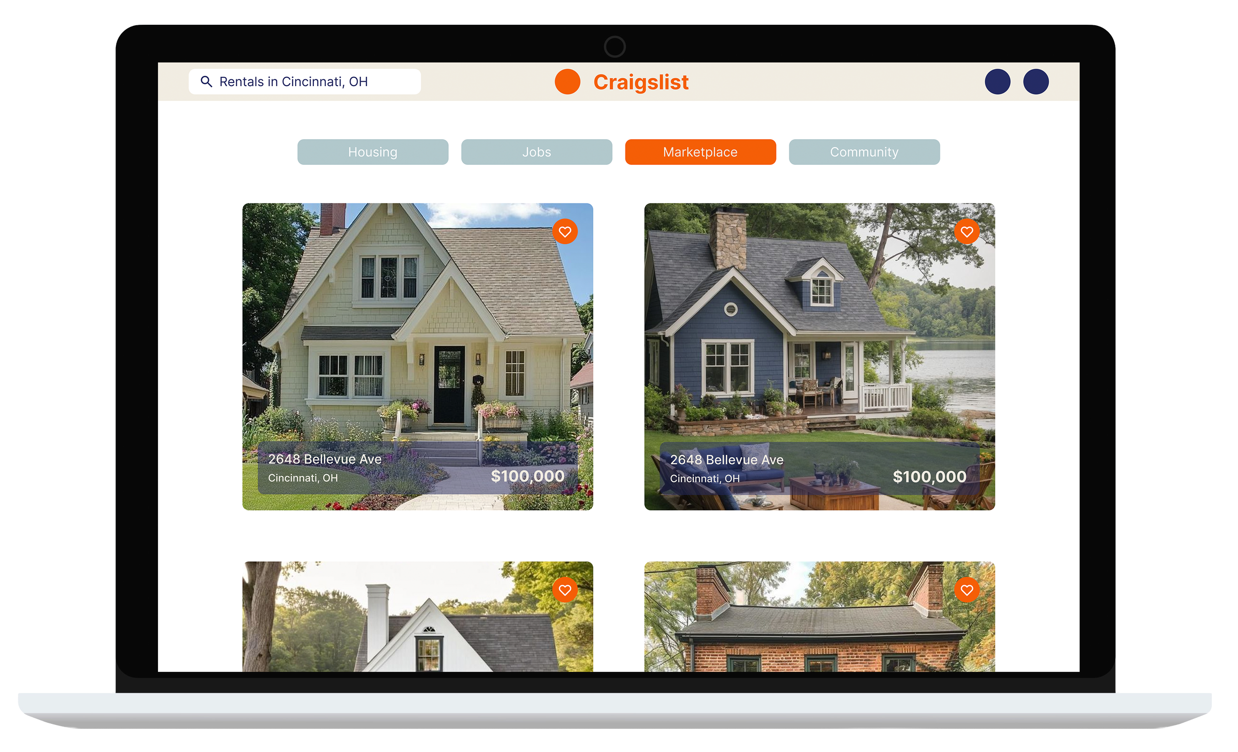
Refined layout, typography, and color palette to improve clarity and trust while modernizing the interface with soft blues and neutrals.
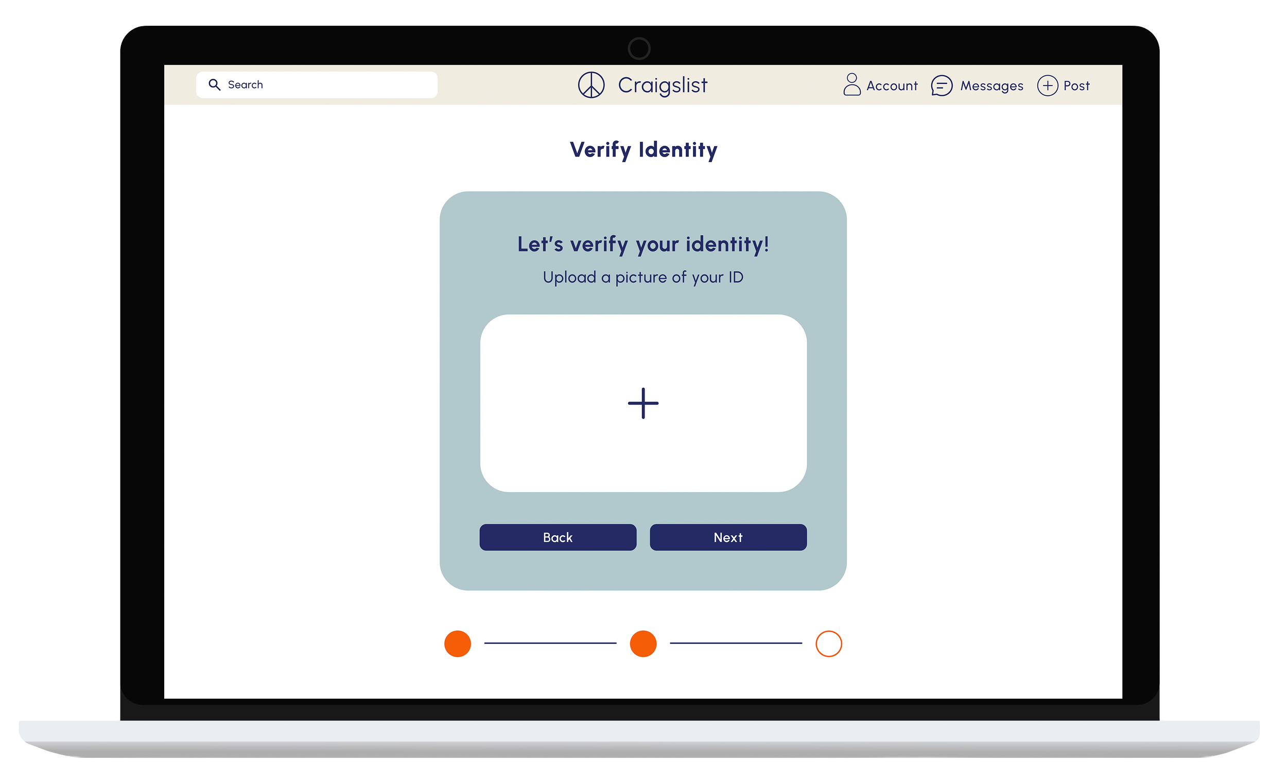
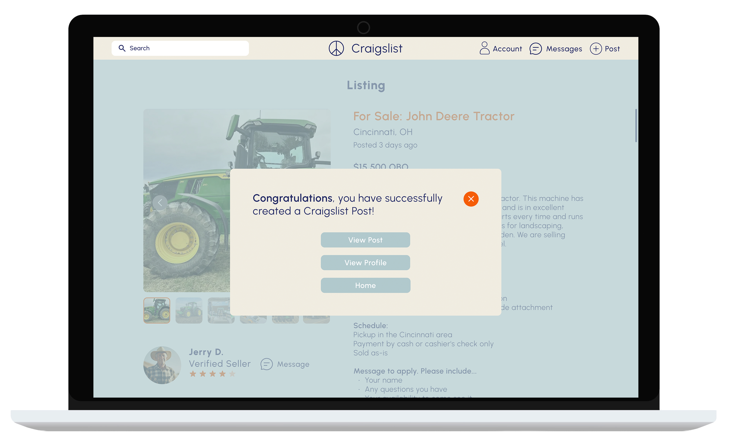
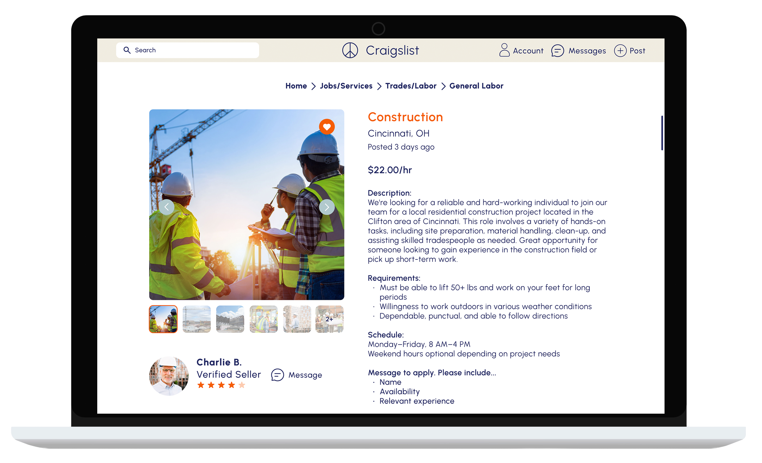
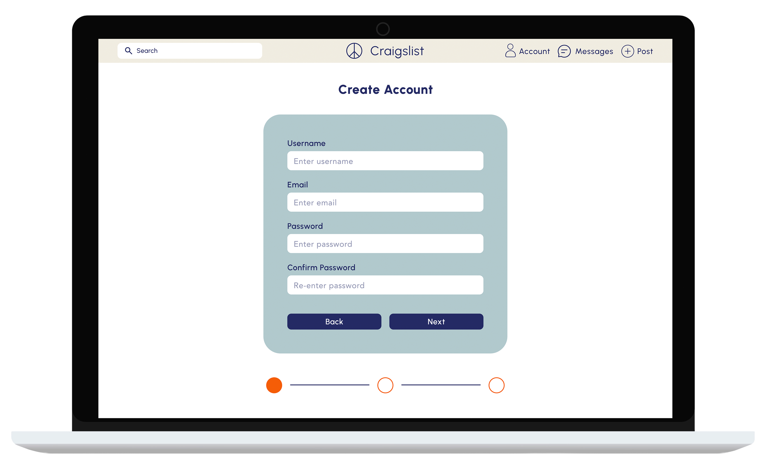
Final Screens
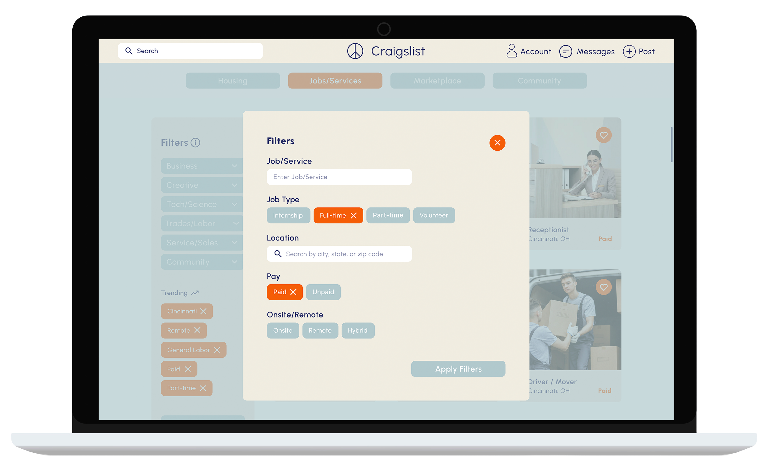
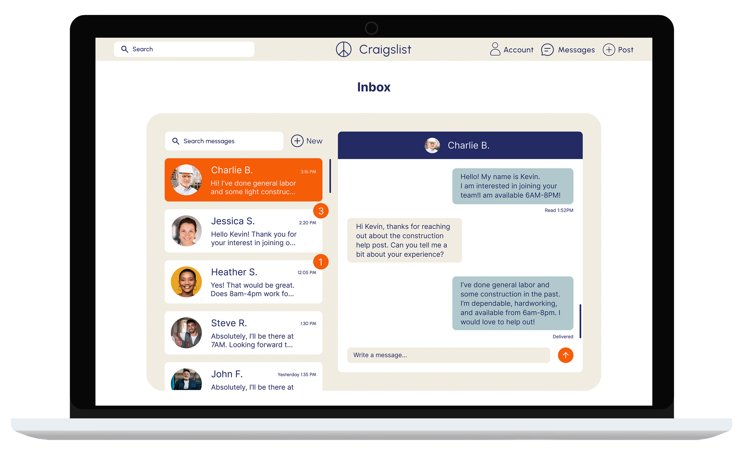
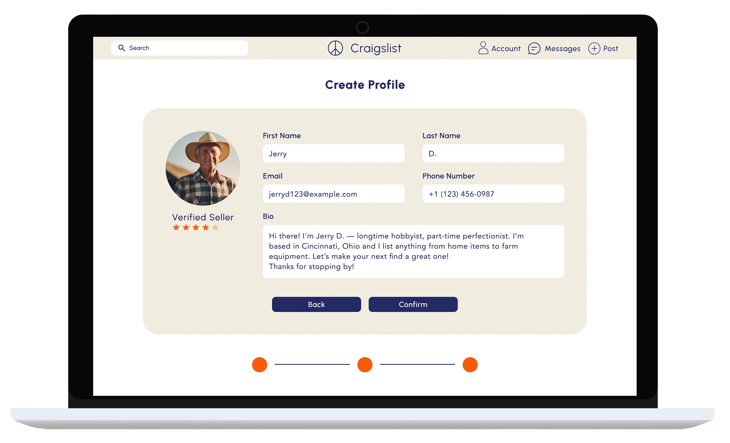
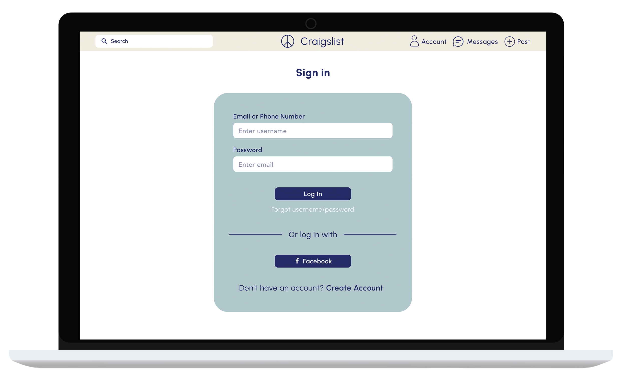
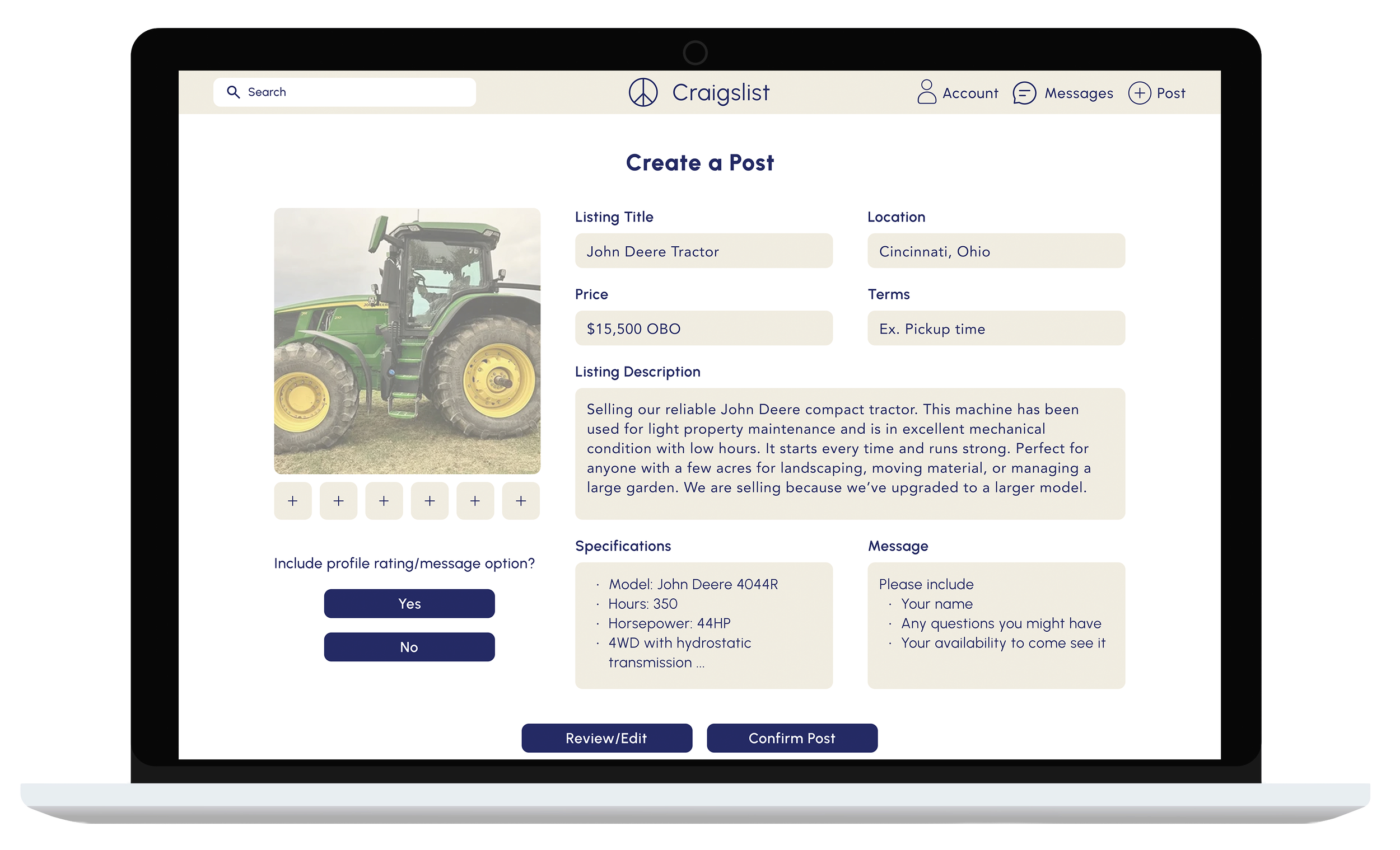
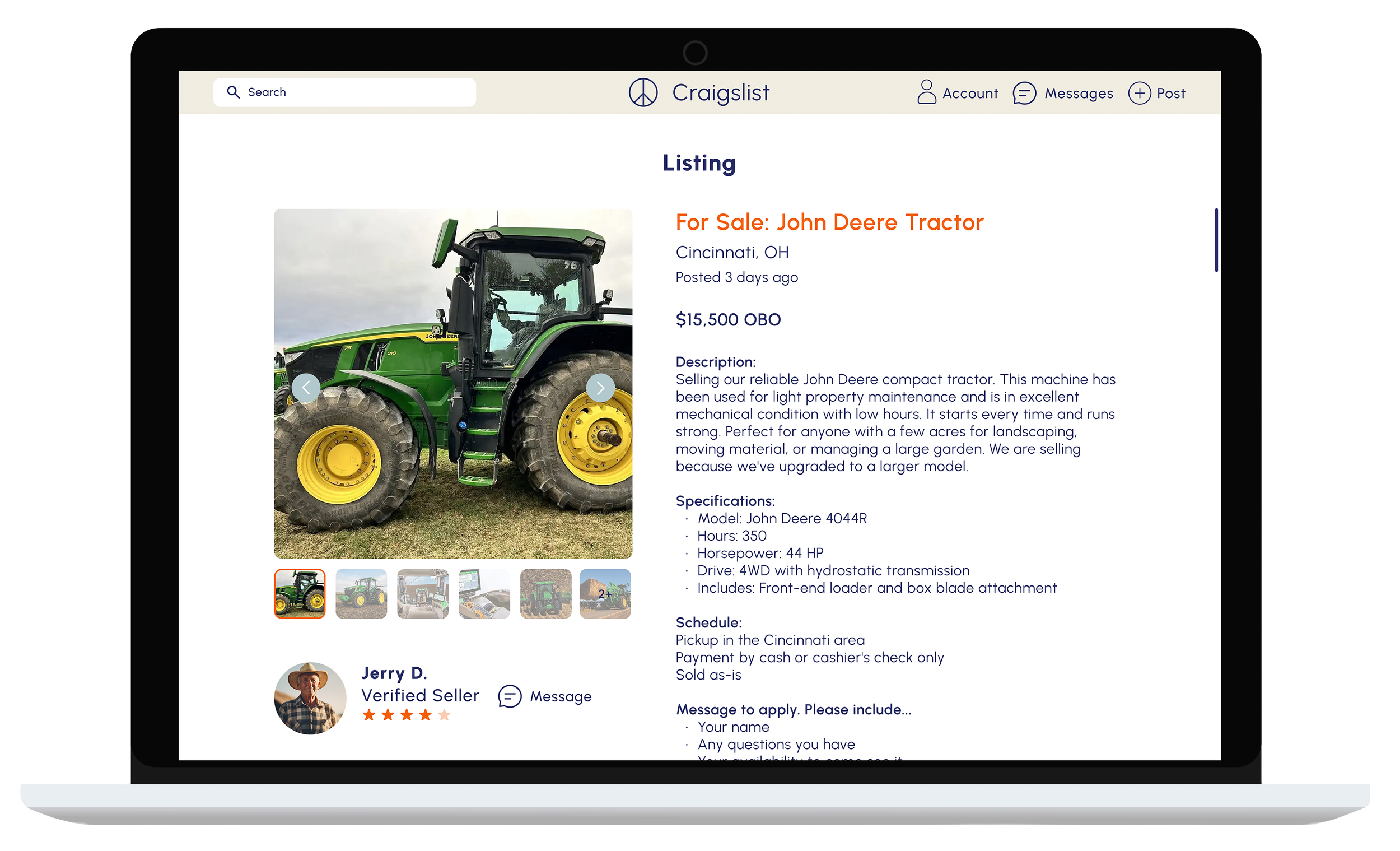
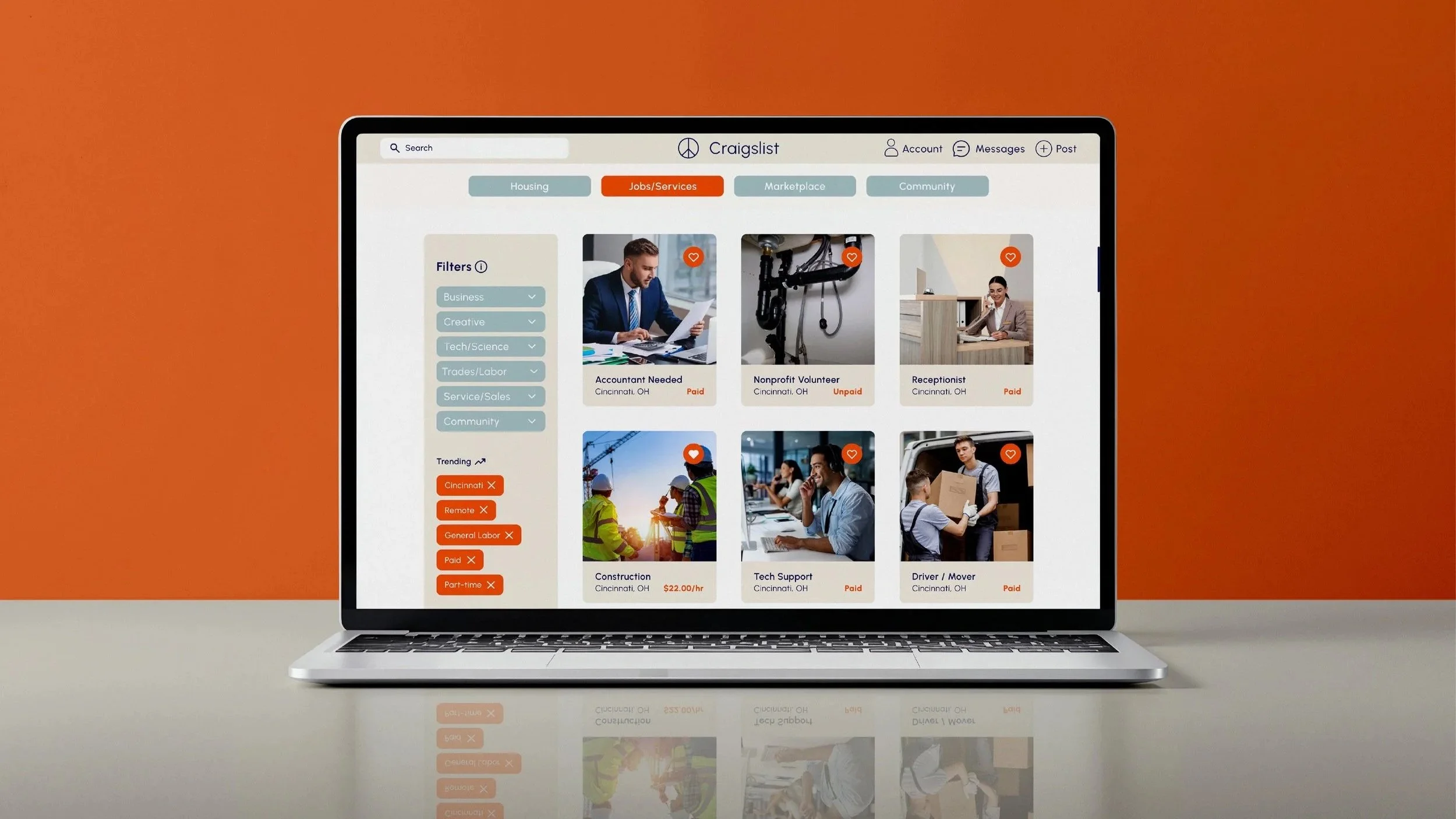
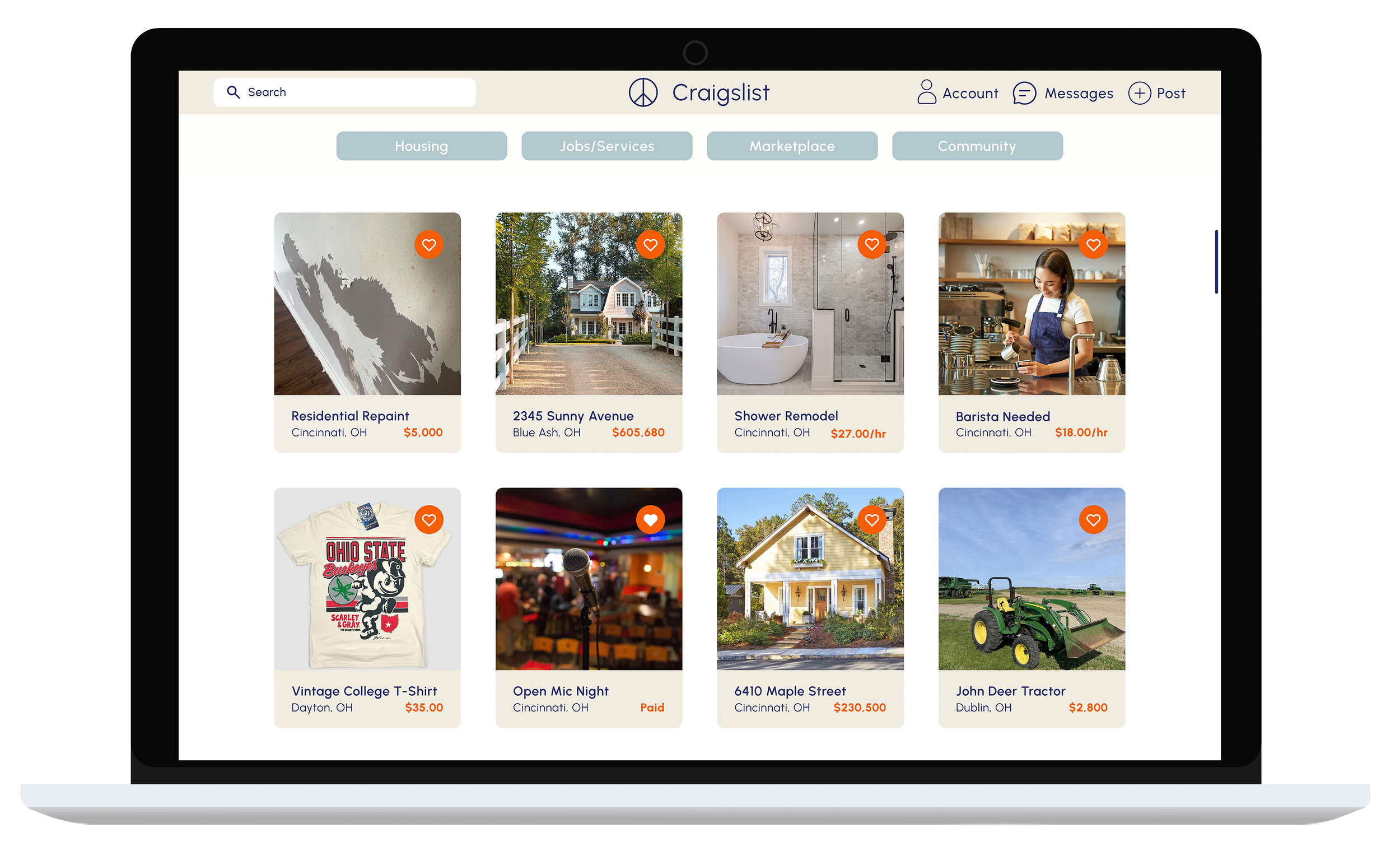
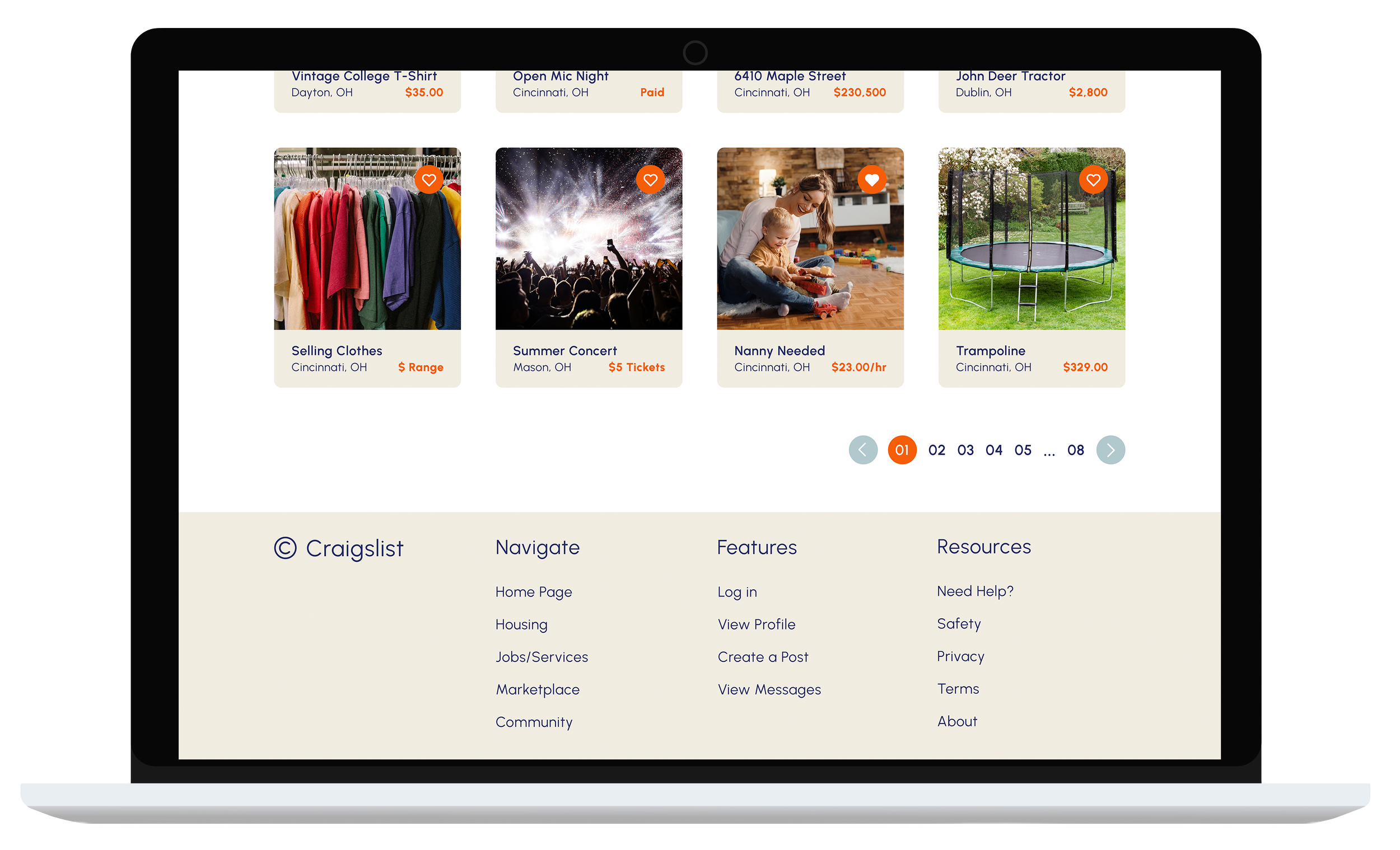
The final screens bring the Craigslist redesign to life with a cleaner, more intuitive interface. Consistent layouts, clear navigation, and simplified interactions create a more modern and trustworthy experience across key user flows.
Mood Board & Style Guide
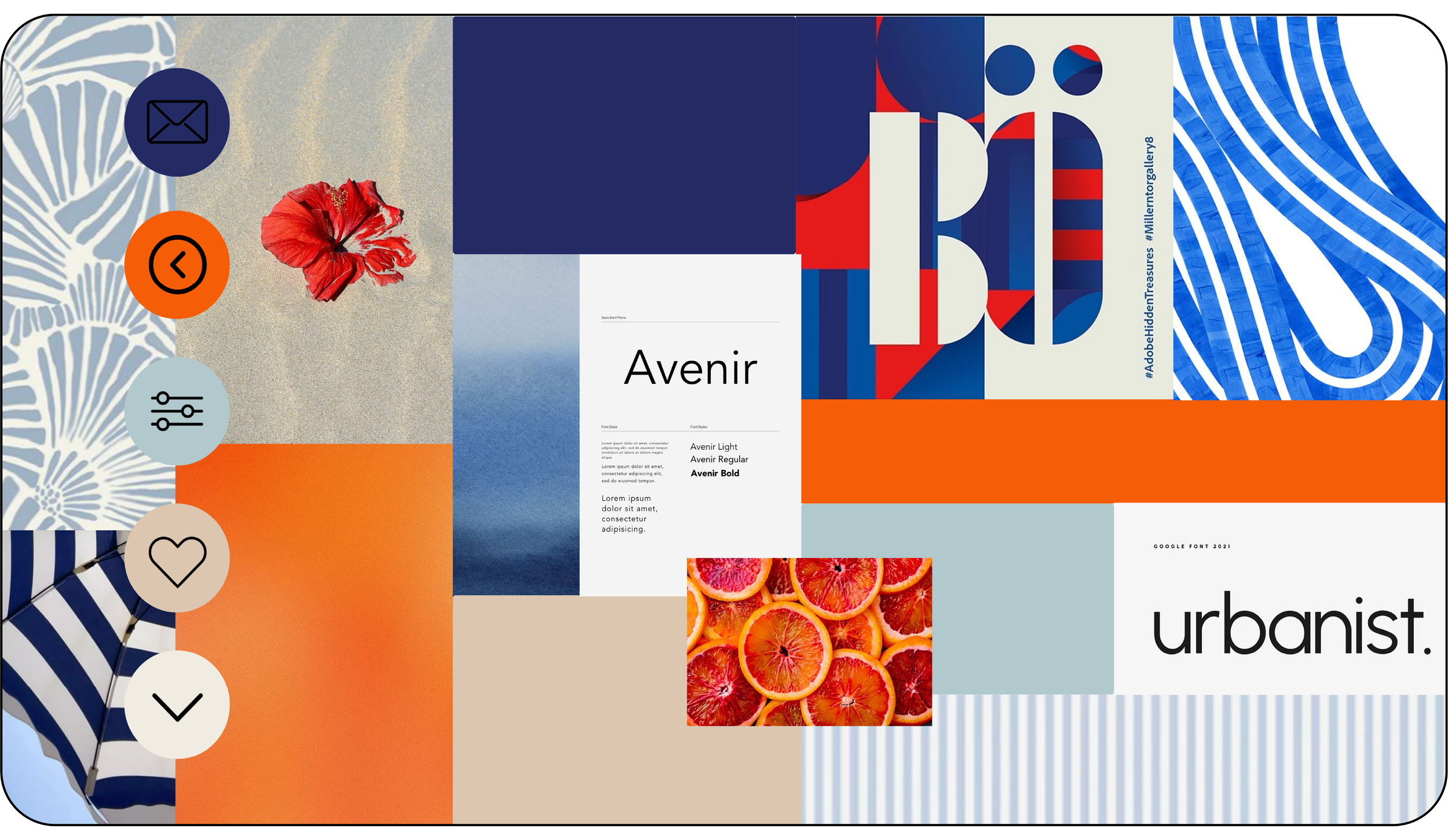
Defined a modern, familiar aesthetic with a neutral color palette, clean typography, and subtle iconography. The style guide ensured visual consistency, readability, and user trust across the interface.
Final Prototype
All prototyping was done in Figma.